Table of Contents:
What Is The Bricks Builder Toggle Element?
The Bricks Builder toggle element is a neat little component that packs some serious power! The Bricks Builder toggle is a button. That means when users interact with it by clicking or using the keyboard to trigger it, it will perform a very specific action.
So what Does The Toggle Actually Do?
The toggle will add attributes to an element or a series of elements with the same selector. So you can use it to add a class or a data attribute!
If you are asking why you would need to add a class or a data attribute to an element, here are a few example use cases:
- toggle a popup
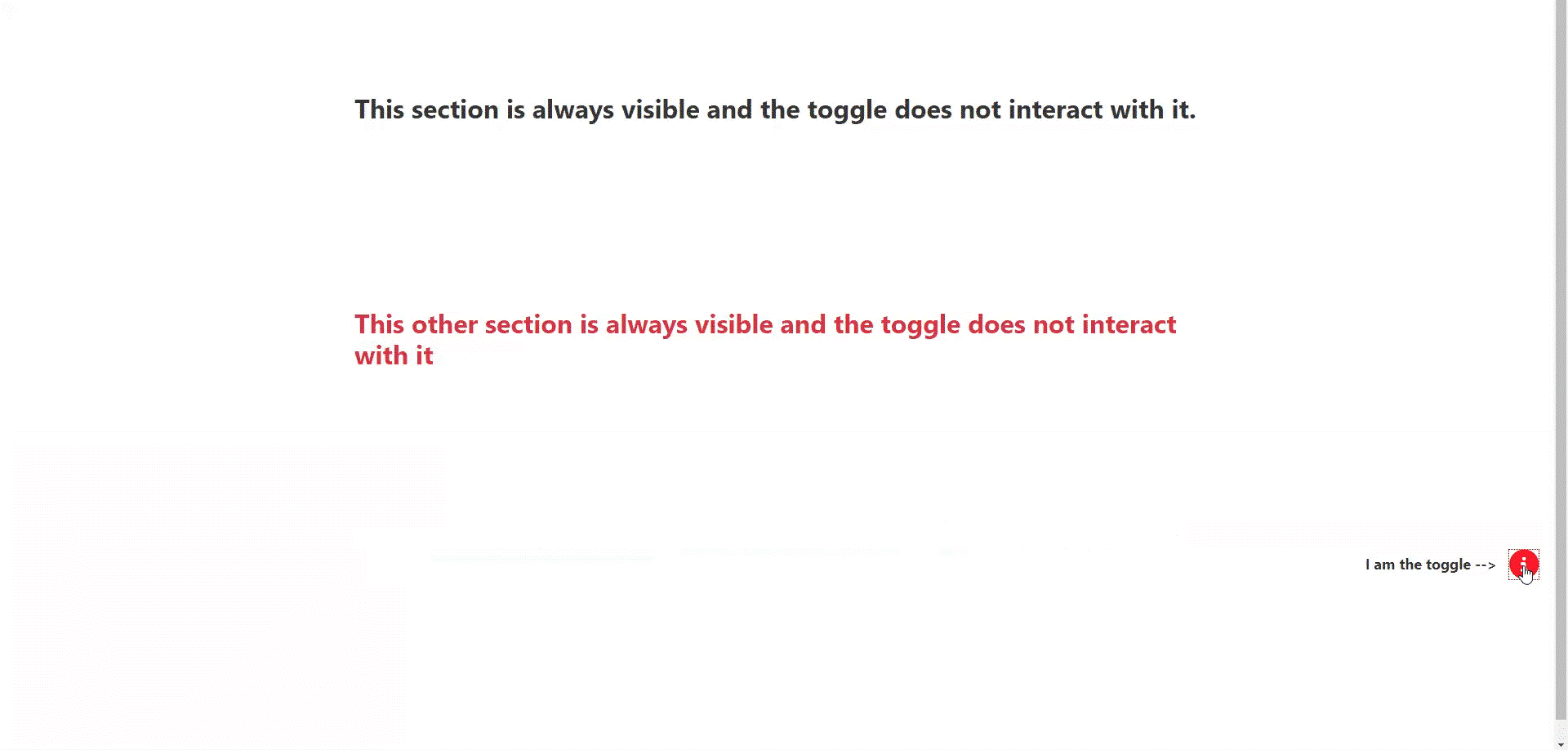
- show or hide a section or element
- change the background color of a section
- make a specific text element bigger
See Our Custom Popup Component
I have crafted a special component that will popup a contact us form. This is great for capturing leads on your website!
See The ComponentHow Do You Set Up The Bricks Builder Toggle?
Step 1: Add the toggle element to your structure panel and position it where you want users to see it. I sometimes will use either fixed or absolute positioning to place the element exactly where I want.
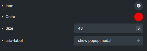
Step 2: select an icon or SVG so users can see it clearly. The toggle can be set to any icon that comes with Bricks, or you can use a custom SVG that you have loaded to your site.
Step 3: Add a color and change the size to your on preferences or client’s specifications.
Step 4: add the aria-label for accessibility. The best way to do this is to write a short description about what will happen when the user interacts with the popup button.
Step 5: Pick an element from your page or template that you want the toggle to interact with. Then, copy it’s ID or a class and paste this value in the CSS selector parameter. This will tell the toggle button which specific element is going to get the data attribute added and then removed each time the toggle is clicked.
Step 6: chose which attribute and value you want to add and then remove. This can be a bit tricky to understand at first. A simple example would be to toggle the class attribute and value “hidden” on and off. In a nutshell, that means you will add and remove the class “hidden” each time the toggle is clicked.
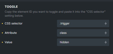
In the image above, we set the toggle CSS selector to a class. That means that the toggle with work with any element on the page that contains the class “.trigger”. If you have 10 elements with the “.trigger” class, then the toggle will work on all 10 of those elements at the same time.
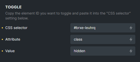
In the second image above, you can set the toggle CSS selector to a single ID. That means that the toggle with work with only 1 single element on the page that has the ID “brxe-ieuhrq”.
See Our Custom Popup Component
I have crafted a special component that will popup a contact us form. This is great for capturing leads on your website!
See The ComponentLets Inspect The DOM To See The HTML
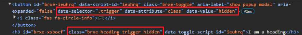
In the image above, you can see a button and a single h3 heading. The button element is the toggle and you can see the settings we added with the builder have been applied as data attributes to it. The h3 heading will get the class “hidden” added and removed each time the toggle is clicked.
The hidden class is shown below:
.hidden  {
    display: none;
}
So every time the toggle is clicked, the heading will be shown and hidden by adding and removing the hidden class.
Pretty neat!
Wrapping Up With The Bricks Builder Toggle Element
As you can see, the toggle element can be quite powerful. It is used to add and remove (aka toggle) data attributes to specific elements on your webpage. Take some time to think about how you want users to interact with different elements on your webpage and then see if maybe a simple toggle could help achieve your desired user experience. Remember, the toggle works by setting up the element you want to interact with and then what data attributes you want this element to have added and then removed by each subsequent click.